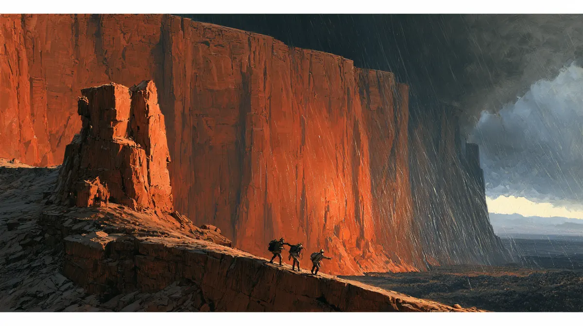
Factory floor / Production case study
THE LOST WORLD:
PROOF OF WORK
I set out to make a graphic novel that could hold together from its first sketch to its last printed page. The work took me through world design, page plans, painted panels, a lettering reset, and print preparation. Each time the book exposed a weakness in the factory, I changed the factory.
Open the production files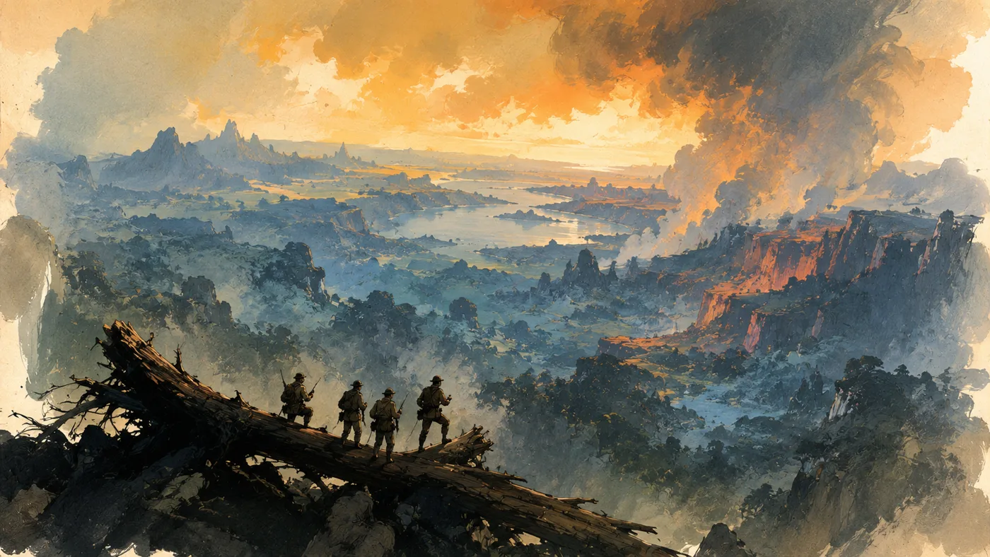
01 / The production problem
A good image is not a finished comic.
A panel can stop you cold and still fail the page. Turn it beside the next panel and a coat changes, a creature loses its shape, or a balloon gives a line to the wrong person. The picture works alone. The story breaks.
That was the real test when I adapted Arthur Conan Doyle’s The Lost World into a new full-color graphic novel for Man of Ages Comics. I wanted adventure storytelling with the legibility of a classical comic and the loose, chunky handling of a painting. I did not want 372 unrelated illustrations that happened to share a title.
I chose the story beats, the visual direction, and which versions could move forward. ChatGPT helped carry out the work: drafting, organizing, making visual candidates, checking continuity, assembling pages, and keeping the record. Those saved decisions mattered when a page failed. I could see what had been approved, where the break began, and which stage had to answer for it.
The ICM folder factories made that collaboration recoverable. Each stage had inputs, an owner, an output, a review, and a next gate.
02 / Build a world that can survive repetition
Production design before page production.
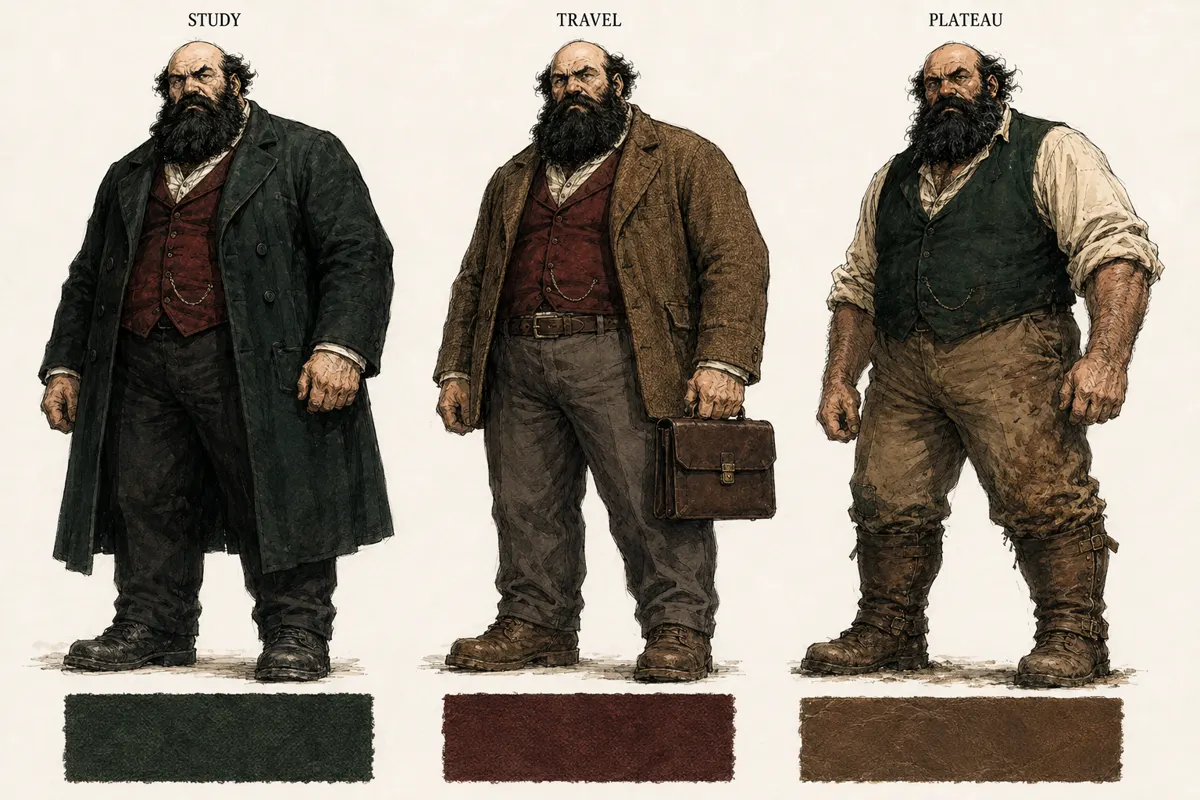
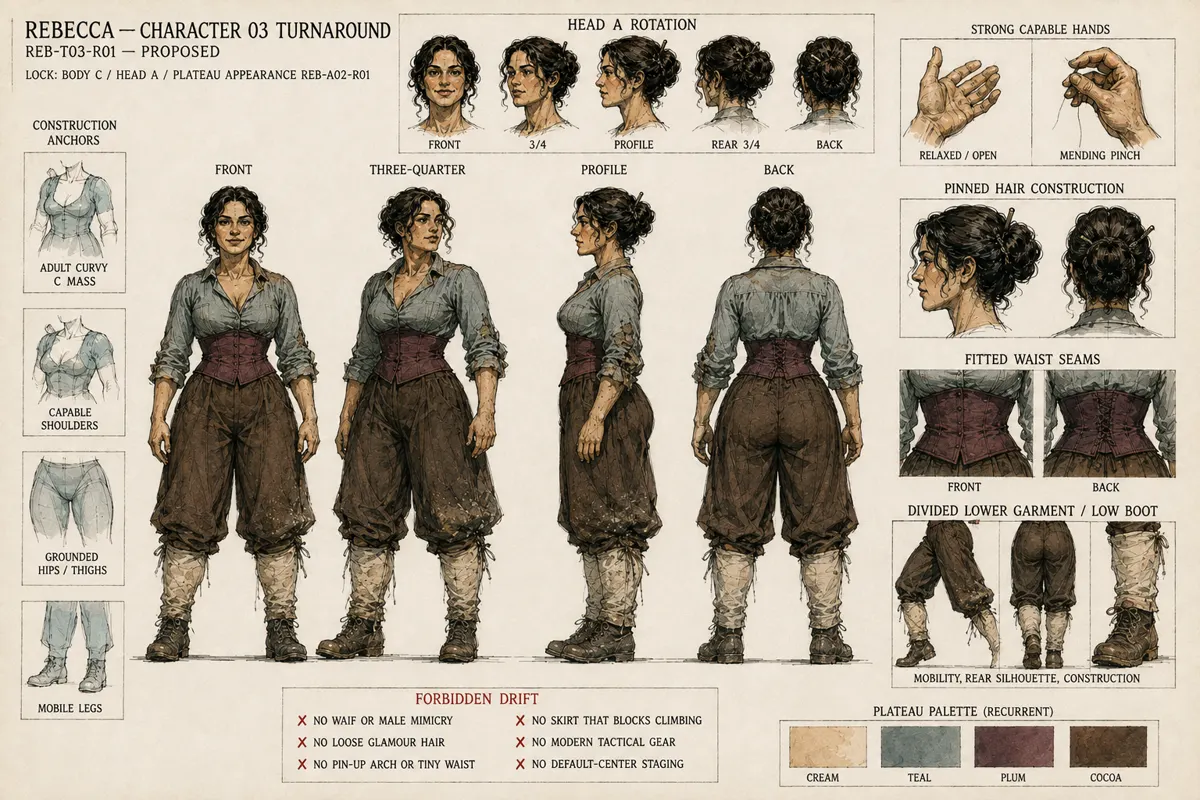
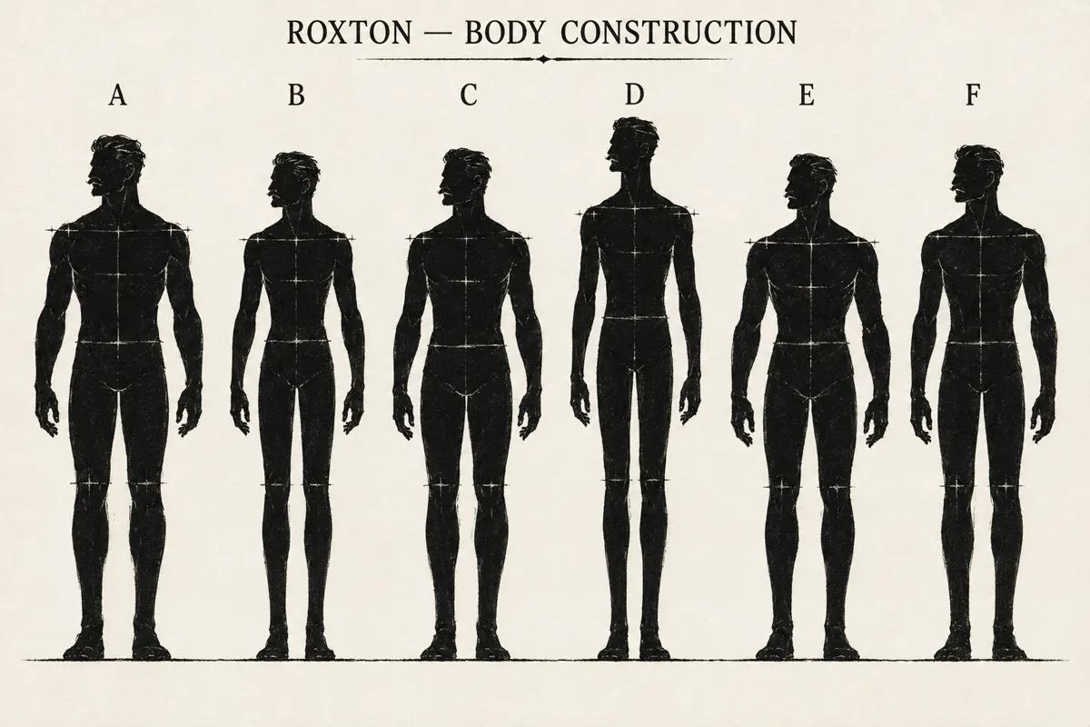
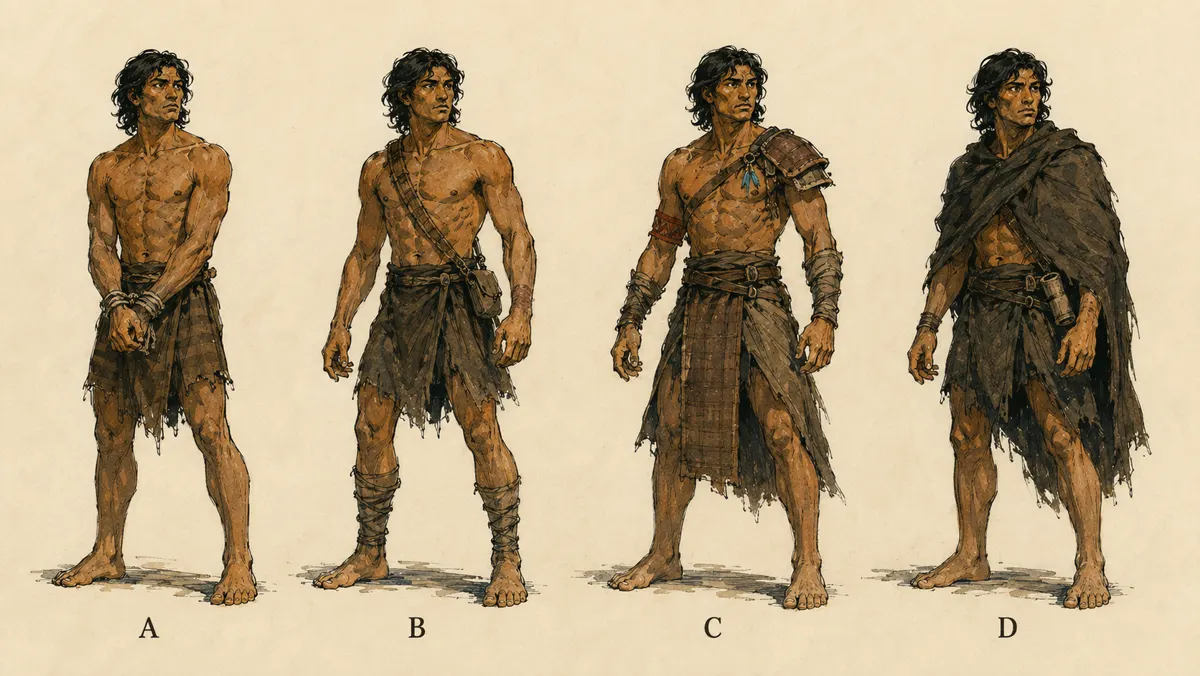
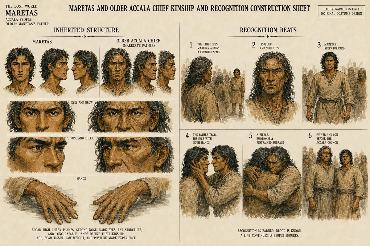
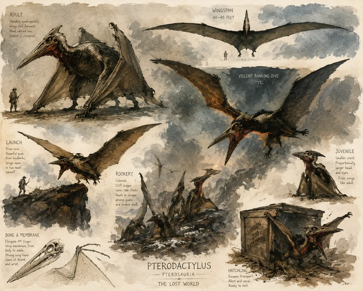
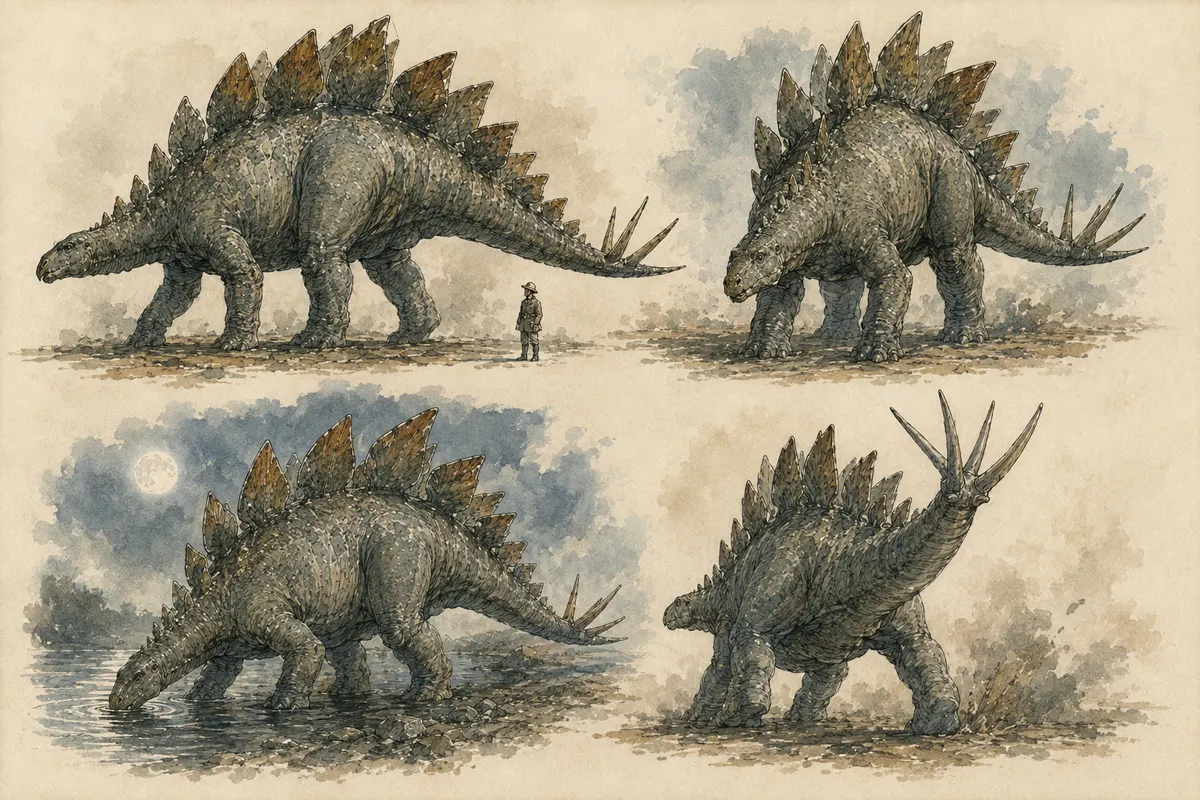
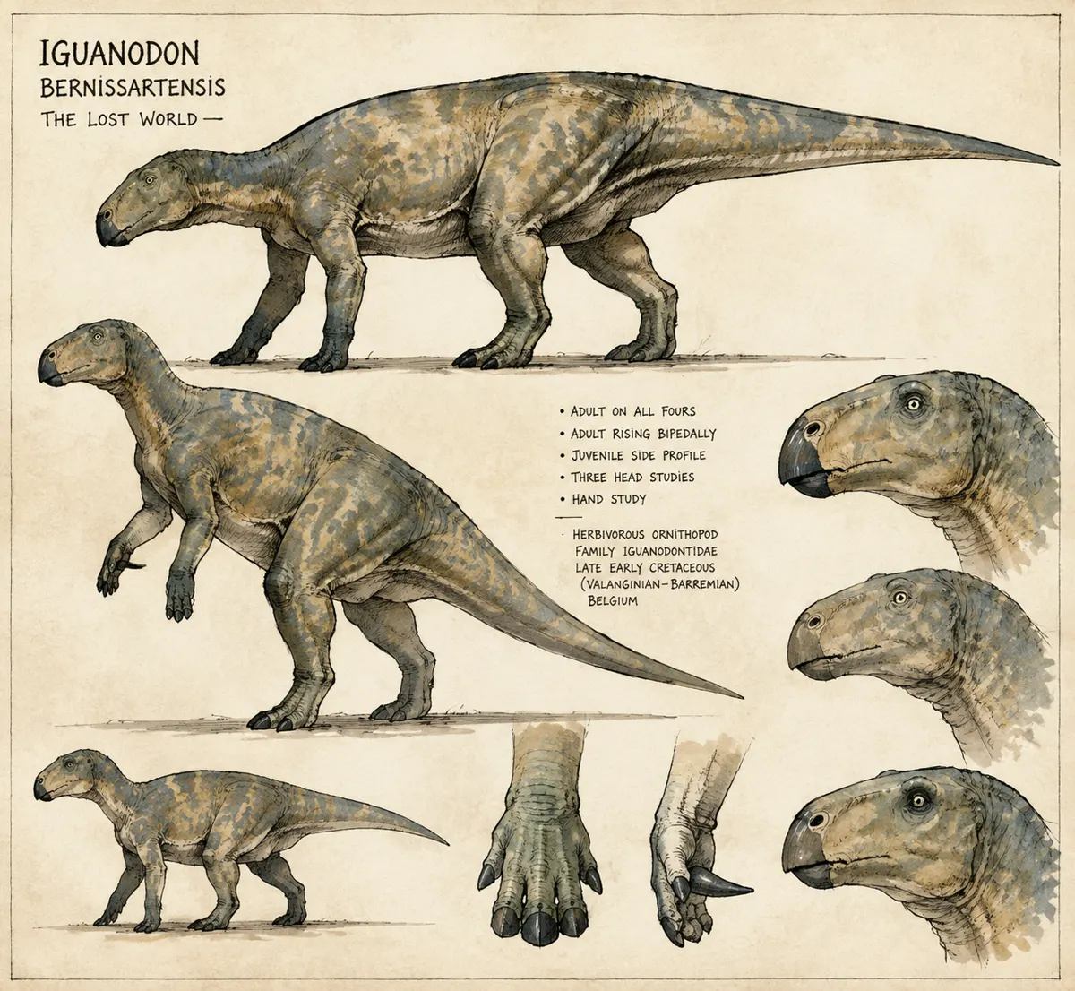
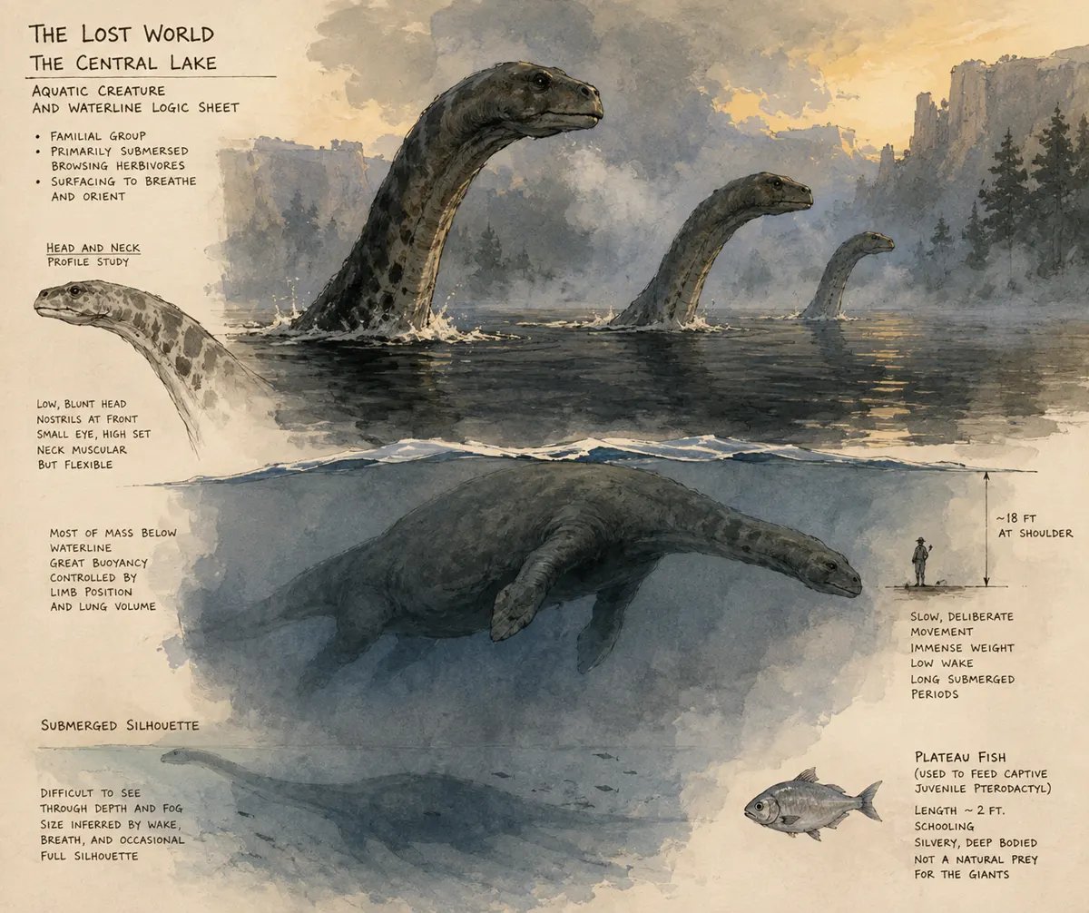
We built a visual library for the principal cast, the Accala people, the ape-men, creatures, props, and recurring locations. The point was not to make a mood board. It was to answer practical questions: Can Malone be recognized from behind? What happens to a costume after days on the plateau? Does the predator still read as the same animal in a new light?
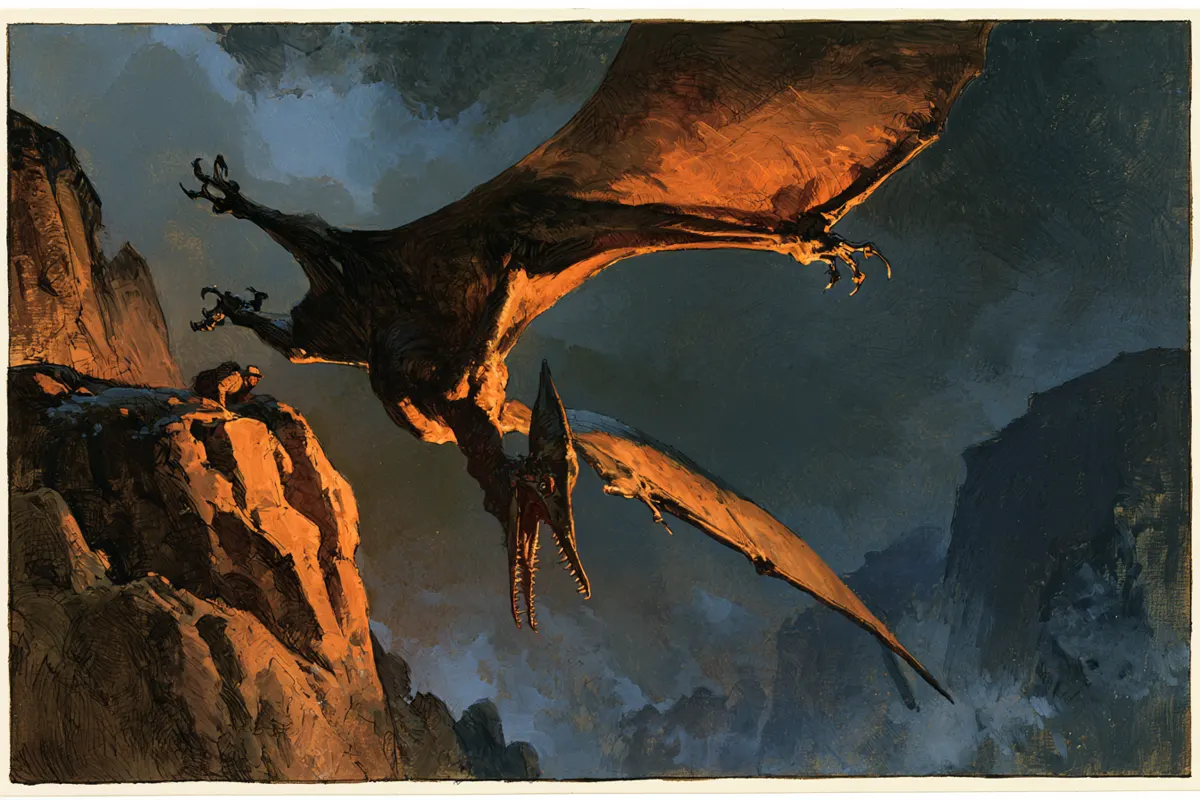
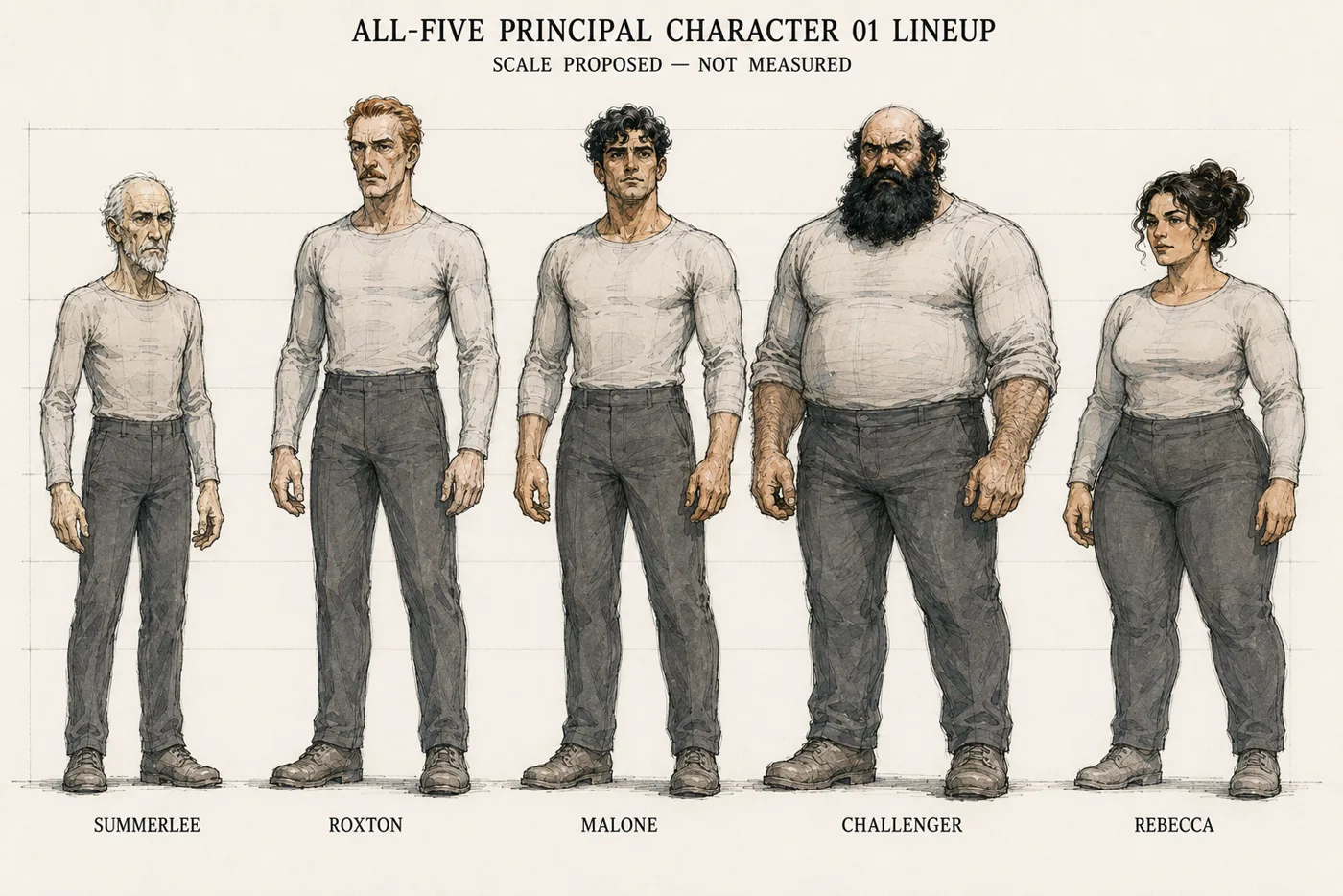
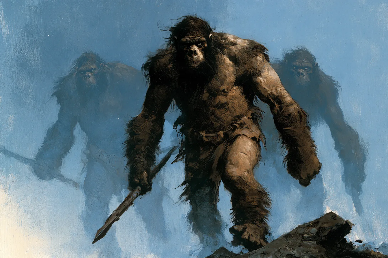
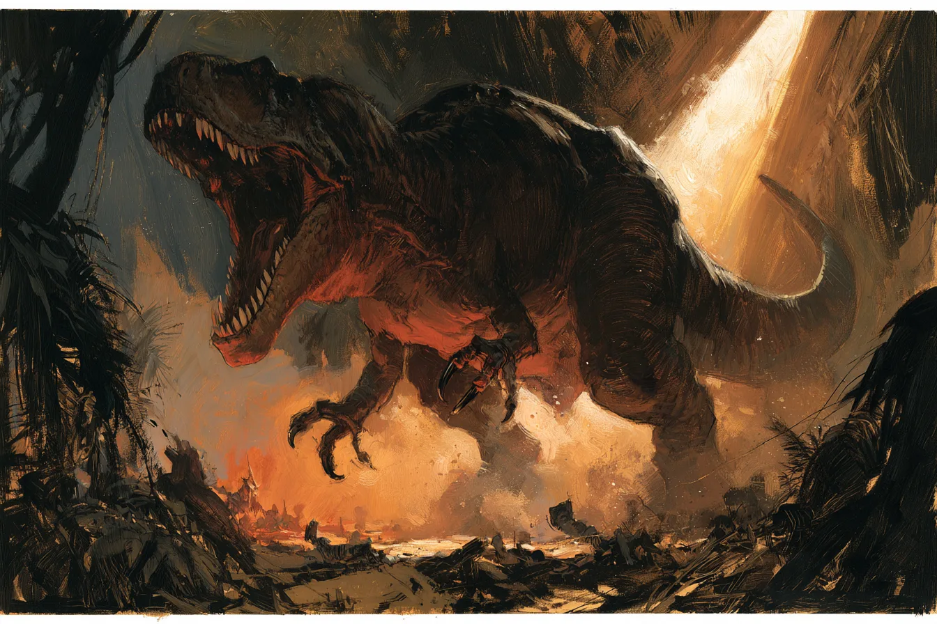
I checked the five principal characters together so their scale and silhouettes would hold from page to page. The lineup below was a control, not a finished panel. The ape-men and predator paintings set the weight, color, edges, and brushwork I wanted to see again. A new panel had to belong to that world.
Influences became operating rules.
I went back to the adventure-comics grammar I love. Alex Raymond suggested how to keep geography and visual hierarchy clear. Jack Kirby and Alex Toth reinforced the power of a strong breakdown, silhouette, and readable force inside a frame. John Buscema’s camera language pushed us to specify distance, height, and depth. Frank Miller taught the value of withholding or releasing a beat; Will Eisner made the case that an unusual page shape has to earn its place in the story. Scott McCloud kept us honest about what readers must connect across a gutter.
We studied those principles as reference, not artwork to copy. The result was an original rule set: mostly stable rectangular panels, dynamic staging inside them, a named dominant beat on each page, and a silent-read test before finish. The Kirby Museum’s layout study, Ohio State’s Toth archive note, and McCloud’s account of comics’ language are useful starting points.
03 / One beat through the factory
Pencil. Four values. Paint. Page.
I roughed the whole book before I finished the exciting pages. The first 76-page pass gave me 228 A/B/C thumbnail alternatives and 76 chosen page plans. Story and continuity work later took it to 100 story pages. The book grew because the pages asked more of us.
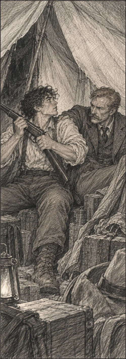
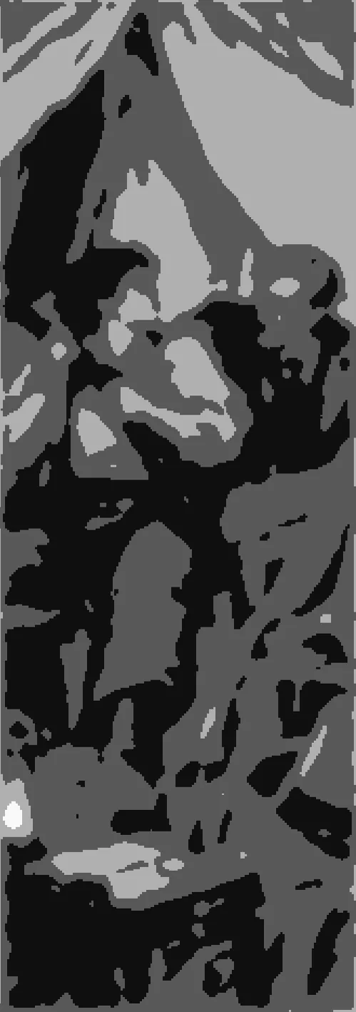
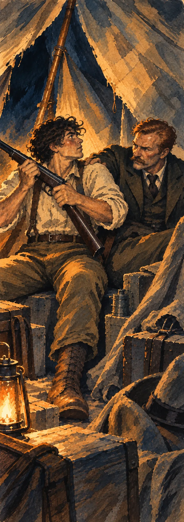
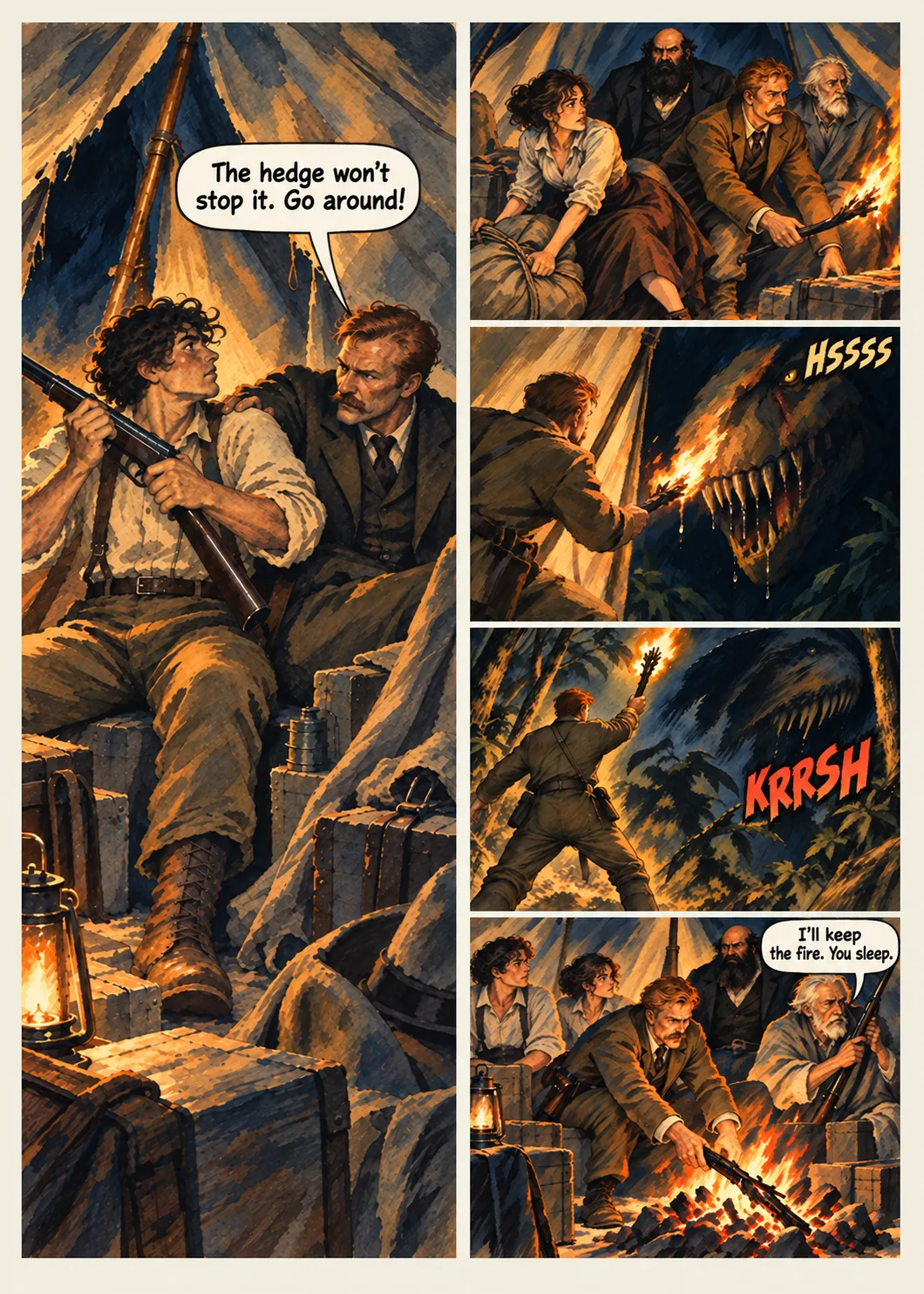
The S31 tent scene shows the order of work. First the locked pencil fixes the figures and the tent around them. Then four plain values make the light readable before color can hide a weak choice. Only after those decisions hold does the painted panel earn its place on the art-only page, ahead of the lettering pass.
04 / The factory changed because the work pushed back
The failures became new gates.
The misses stayed in the record. Some were small; some forced me to change how the next pages were made. Four corrections reshaped the factory:
Plan the whole book.
Wayne approved a pencil/value calibration, so the factory made rhythm, page architecture, scene pencils, panel-state continuity, value studies, and locked render packets mandatory before final art. A technical page and a difficult ten-page pilot came before bulk production.
Stop false value and drift.
After S13, some “value studies” were really toned or sepia pencils. Costume states, ape-men identity, and scene geography drifted. The new rule rejected false values, required an establishing or re-establishing view when geography changed, and made continuity a sequence-level check.
Protect the paint.
Early finals grew too tight and synthetic. Wayne called for bigger strokes, fewer marks, lost edges, and the selected Production Design paintings as surface authority. We calibrated one locked panel at full size and thumbnail size before scaling.
Put review before lettering.
Art-only page order, operator and director checks by sequence, script and speaker checks, corrections, independent review, and cover-last logic were made explicit. After an overloaded image viewer crashed the old chat, response-level image-load limits became a factory safety rule too.
When the full render began, each of the 372 active panels was made from its locked pencil crop, matching value crop, Production Design references, and the selected painterly surface. Eleven sequence gates checked continuity and finish before the 100 art-only story pages were accepted for the next stage. Extra figures, a character-identity mismatch, a five-beat sequence that had collapsed into a shared crop, and an unreadable reaction were corrected without erasing earlier attempts.
05 / Lettering is page design, not decoration
We changed the route after building it.
Comic Life gave me editable pages, and we built a full interior with it. But page after page, balloon placement and tails cost too much time. I stopped the route there. Finished files were no reason to keep making the same mistake.
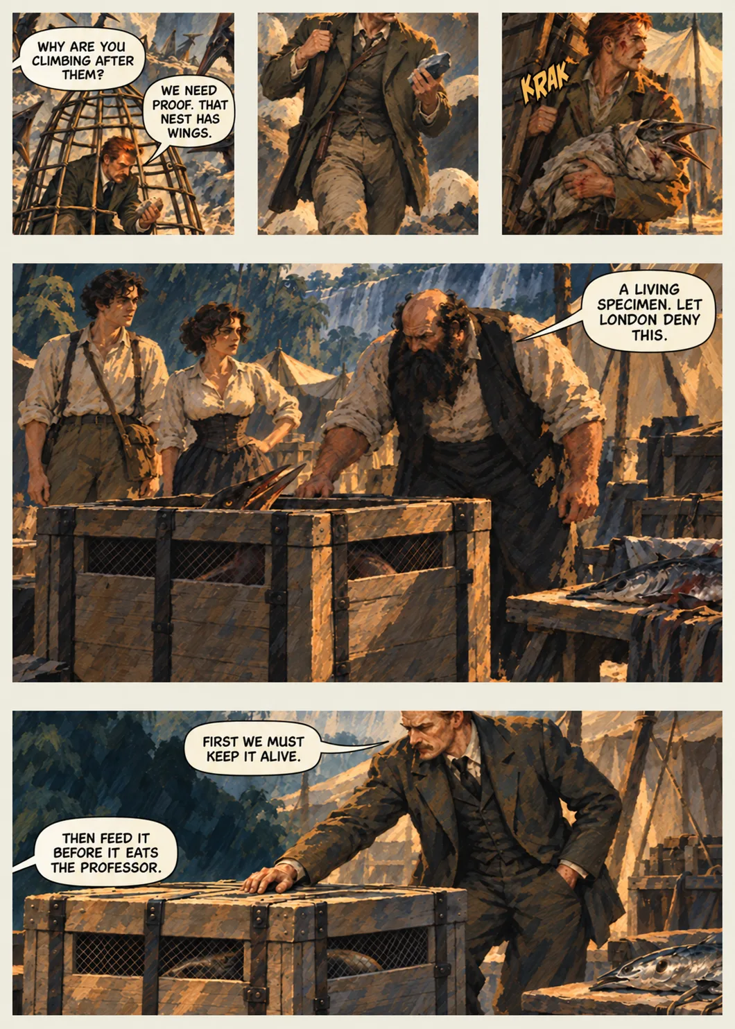
We rewrote the dialogue, narration, and effects as a new R04 script with 343 exact text events and speaker identities. Then we returned to clean, unlettered Stage 04 pages. The Create Image lettering pass made fresh balloons, captions, and effects on 76 pages; 28 silent or provisional pages carried forward unchanged. Each new page was checked for exact words, reading order, speaker, tail, faces, and protected art. The Comic Life balloons were not reused.
On the page shown here, the storytelling problem is specific: a question, a reason to take the animal alive, the physical capture, and the joke have to read in that order. A good letterer is controlling attention and time, not just filling empty sky.
06 / Two deliveries, two different tests
A browser page is not a print page.
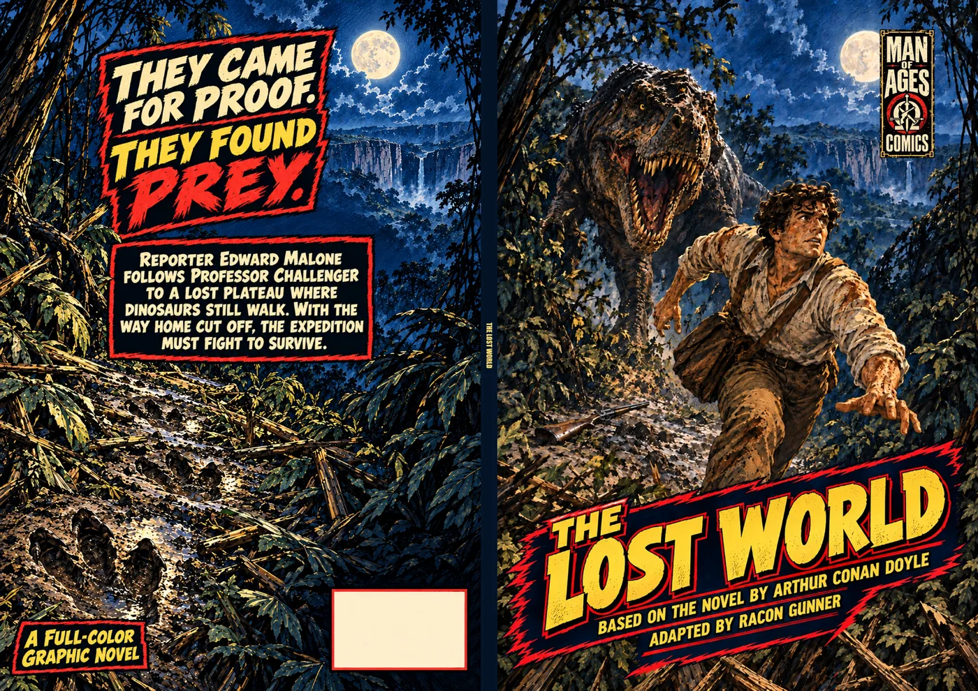
The public graphic novel has 100 story pages inside a 104-page interior. The web reader has a separate cover. For print, Wayne ran his Photoshop up-res batch on the pages, but 300 dpi did not magically solve KDP’s safe-area problem. We had to give the artwork and balloons more room on the physical sheet and check the new interior in the preview. That is a production lesson I will carry to the next book.
The complete web book is live on The Gutter. As of this case study, Wayne has submitted the paperback and Amazon KDP lists it as In review, not live. I will not turn a submission into a release claim.
What I would carry to the next production
THE FACTORY DID NOT REMOVE JUDGMENT.
IT KEPT JUDGMENT IN THE WORK.
Prove the difficult page before scale. A single attractive panel cannot qualify a 100-page book. Test a technical page and a consecutive run first.
Separate the jobs. Story, design, geometry, value, painted finish, lettering, web, and print have different failure modes and different approvals.
Keep the rejected version. The correction means more when the prior state and the reason for changing it remain inspectable.
Make the handoff exact. A filename, revision, approved source, speaker, crop, and next gate beat a vague “looks good” when another stage takes over.
This is an AI-assisted production: the concept and finished images use generative image tools, and ChatGPT assisted with writing, execution, checks, and records. Wayne directed the creative decisions and approved the work. The artists named above were studied for storytelling principles; their artwork is not reproduced here.
The proof is the finished work
READ THE ENTIRE
GRAPHIC NOVEL.
Then come back to the pages above and ask what each stage prevented, what it missed, and what should change next time.
Read The Lost World on The GutterThe production design archive / 17 selected studies
THE WORLD
BEFORE THE PAGE.
Here is what those decisions looked like before they became panels. These were working images: bodies to recognize, creatures that could return, places the reader could navigate, and a painted surface the book had to live up to.
Selected from the approved PD-R03 Production Design package. Development sheets and finish references are shown as process art, not finished comic pages.
01 / People who had to survive the journey
CAST & CULTURE
A familiar face had to remain familiar after the clothes, the light, and the danger changed.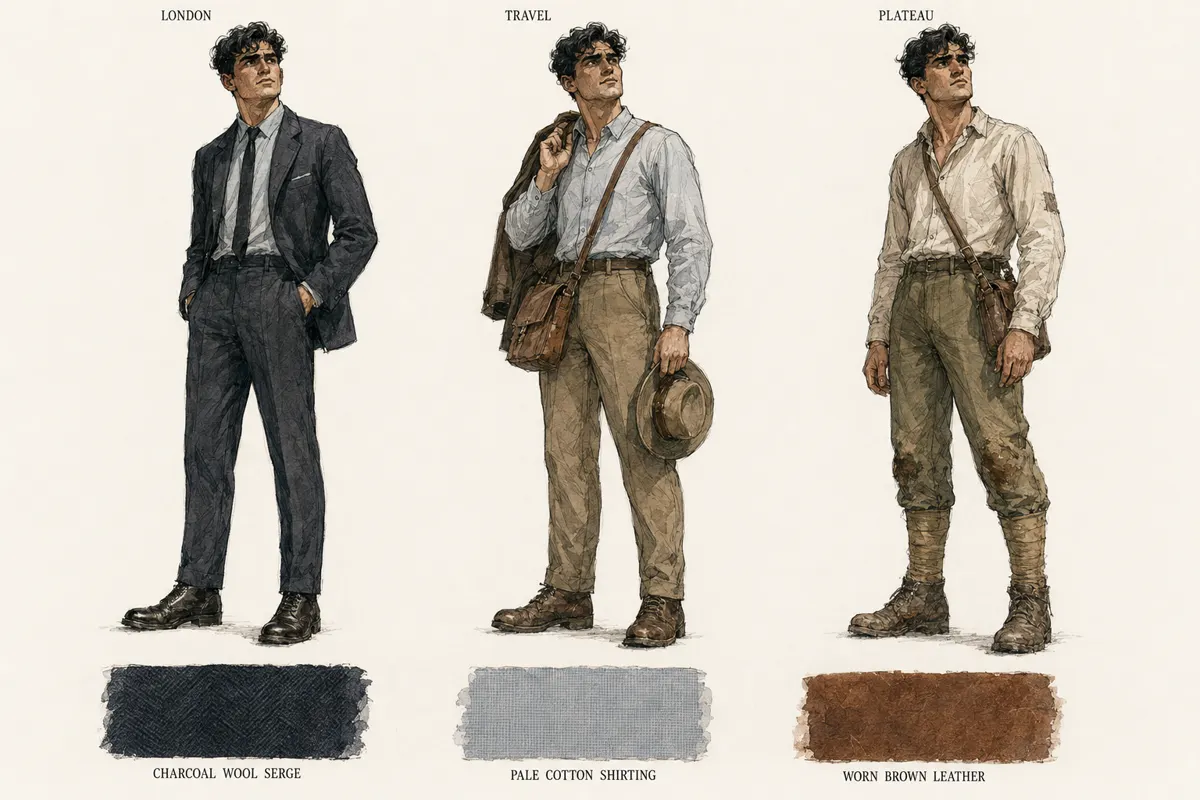
02 / Life on the plateau
CREATURES WITH RULES
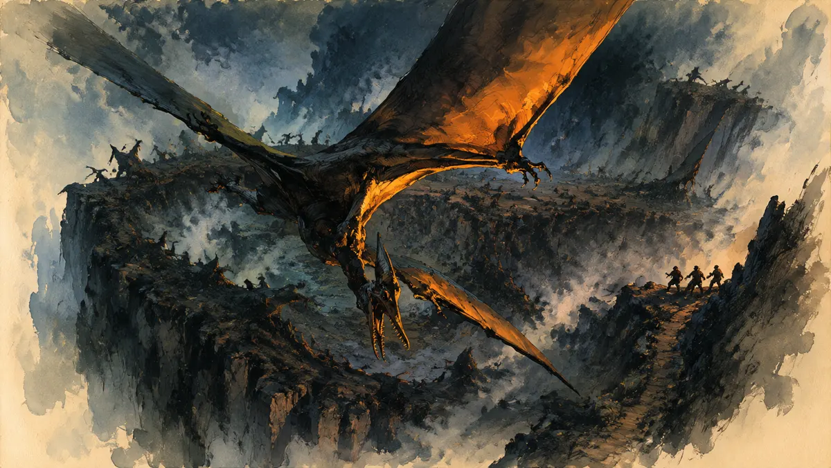
A creature could not become a different animal whenever the camera moved. These sheets gave it shape, scale, and behavior.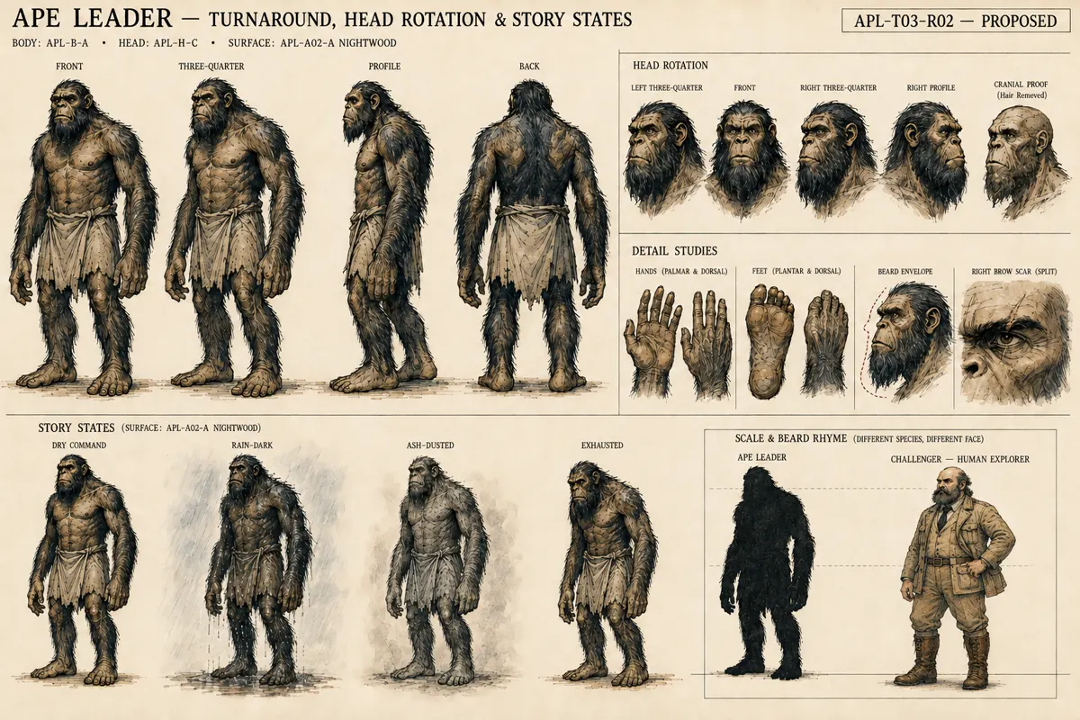
03 / A world the reader could navigate
PLACES WITH CONSEQUENCE
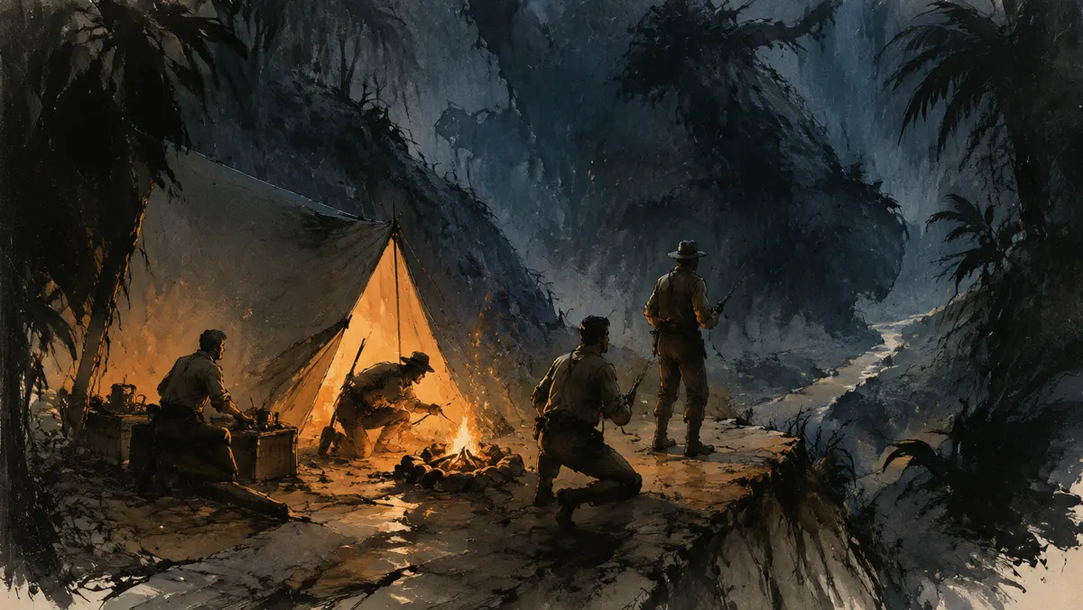
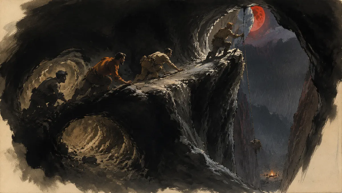
The locations were built for action: a river to travel, a camp to defend, a rookery to cross, and an exit to earn.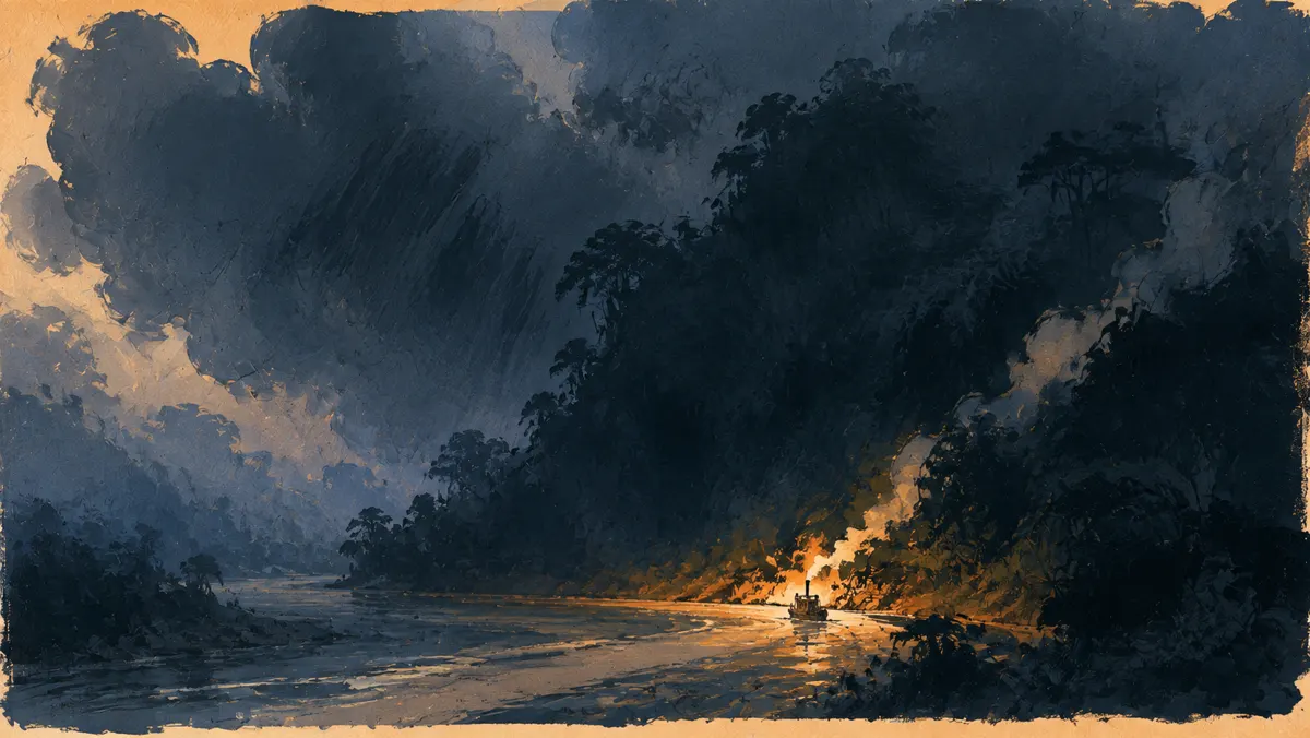
04 / The paint had to hold together
FINISH AUTHORITY
These paintings set the size of the marks, the value mass, and the hot-and-cool color pressure the final panels had to answer to.